We’ve all stood in front of a blank wall, overwhelmed by countless paint color options. Instead of simply following trends, choosing the right colors should be about understanding how they impact the mood of your space. The wrong shade can make a room feel too small, overly intense, or even emotionally draining. This guide highlights colors to avoid and suggests better alternatives to enhance your home’s atmosphere.
Stark White: A Cold and Uninviting Choice
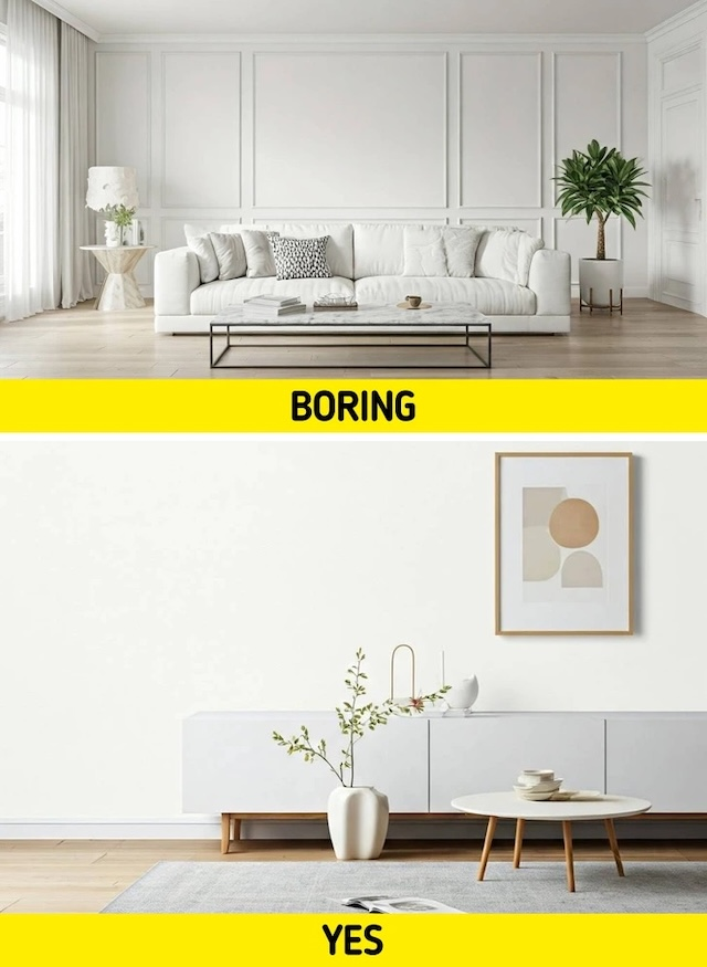
White is often seen as the epitome of cleanliness and modernity. However, a stark, bright white can create a cold, sterile environment that lacks warmth. Instead of feeling fresh and airy, the room may come off as lifeless and clinical, especially under harsh lighting.
Better Alternative: Opt for soft whites like Sherwin Williams’ Origami White (SW 7636) or Benjamin Moore’s White Dove. These tones provide a clean yet welcoming backdrop, making spaces feel open and inviting without feeling too stark.
Neon Colors: Overpowering and Distracting
Neon shades might seem fun and energetic, but they can quickly overwhelm the senses and make a space feel chaotic rather than relaxing. They are often too harsh for home environments and can make it difficult to concentrate or unwind.
Better Alternative: Choose muted pastels, like soft blush pinks, dusty blues, or delicate lavender. These shades add personality without the overwhelming intensity, making them perfect for creative spaces or children’s rooms.
Very Dark Hues: The Small Room Dilemma
Deep blacks and navy blues can create a dramatic and sophisticated aesthetic, but they also have the potential to make a room feel smaller and more confined, especially if the space lacks natural light.
Better Alternative: If you love dark colors, try deep charcoal, slate blue, or muted greens. These shades still bring depth and richness to a space but won’t make it feel as claustrophobic.
Overly Saturated Colors: The Danger of Visual Fatigue
Extremely vibrant, saturated colors like bright orange, fire-engine red, or electric blue may seem exciting at first, but they can be visually exhausting over time. These shades can make it difficult to relax and may even contribute to feelings of anxiety.
Better Alternative: Warm neutrals like taupe, soft greys, and earthy greens create a more balanced and calming atmosphere. These shades are timeless and blend well with a variety of decor styles.
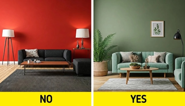
Bright Red: Too Intense for Comfort
Red is a powerful color often associated with energy and passion, but in large doses, it can be overwhelming and even evoke anxiety or restlessness. It’s not ideal for bedrooms or relaxation spaces.
Better Alternative: Earthy greens like sage or olive are much more soothing. They bring a touch of nature indoors and create a calm yet stylish vibe that works well in living rooms, kitchens, and offices.
Lime Green: Loud and Distracting
While lime green is vibrant and energetic, it can also feel overwhelming and out of place in a home setting. This color often clashes with other shades, making it hard to create a cohesive design.
Better Alternative: Try soft greens or warm beiges. These tones maintain a fresh, natural feel without the intensity of lime green. They also pair well with wood accents and neutral decor.
Icy Blues and Mint Greens: Too Cold for Comfort
Cool-toned pastels like icy blue and mint green can appear refreshing at first glance, but they often make a space feel too cold and uninviting, especially in larger rooms with minimal decor.
Better Alternative: Instead of icy tones, opt for warm greys, soft sky blues, or dusty greens. These colors offer the same calming effect but with a more welcoming and comfortable feel.
Browns: Heavy and Dated
While some shades of brown can add warmth to a space, others can feel dull, heavy, and outdated. Dark, muddy browns often make a room look smaller and less vibrant.
Better Alternative: Consider warm greys or taupe. These colors still provide a neutral backdrop but add a modern touch to your space, making it feel brighter and more stylish.
Peach: A Color That Can Feel Outdated
Peach was a popular color choice in the past, but in certain shades, it can quickly feel outdated and overly feminine. It’s a difficult color to match with modern decor styles.
Better Alternative: Soft corals or warm terracotta shades offer a similar warmth but with a more sophisticated and updated look. These colors work beautifully in accent walls or as decor elements.
Overly Trendy Colors: The Risk of Rapidly Aging Your Space

It’s easy to get caught up in trendy paint colors that look stunning in magazines, but these shades often fall out of style quickly, leaving your home feeling outdated within a few years.
Better Alternative: Stick to timeless classics like soft greys, warm beiges, and muted greens. If you want to add trendy colors, use them in small decor elements that can be easily changed, such as throw pillows or artwork.
Matching Everything: The Monotony Trap
Using the same color in every room of your home can create a monotonous and uninspiring atmosphere. While uniformity is good, too much of the same color can make a house feel flat and lacking in personality.
Better Alternative: Instead of using one color throughout, try a coordinated color scheme with complementary shades. For example, warm neutrals in common areas and soft pastels in bedrooms can add variety while maintaining a cohesive look.
Conclusion: Choose Colors That Elevate Your Space
The right paint colors can transform your home into a space that reflects your style, mood, and personality. While bold and trendy colors might seem appealing at first, they can often lead to regret. Instead, opt for timeless shades that provide warmth, depth, and balance.
By selecting the right colors and pairing them with stylish decor, you can create a home that feels inviting, comfortable, and effortlessly beautiful. Remember, a fresh coat of paint is one of the easiest ways to refresh your space—so make it count!


